New Year

2012 went by quick. Looking back, I am thankful for all of the experiences that came my way, photographic and otherwise. I am especially thankful for new inspirations and ideas and some great photographic workshops and seminars I attended. Thanks to the fabulous photographers that put them on. All of it has helped me craft my vision and define my style of photography. And much fun along the way.

Looking to the future and 2013, I already have several exciting trips planned and can see opportunity for my work to grow even more and in different directions. I plan to post more Photoshop hints and tips on the blog, along with samples of new work. So check back often.

I wish you all good health, great treasures and much happiness this year!

“To me, photography is an art of observation. It’s about finding something interesting in an ordinary place…I’ve found it has little to do with the things you see and everything to do with the way you see them.”

– Elliott Erwitt

Creative Work in the Studio

Creative work in my studio is proving once again that I am attracted to shooting inanimate stuff creatively earning me the name of “object chick”.

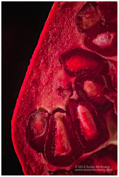
I am working on a new series of prints and one thing I am discovering  is I really do love working  in my studio and creating art out of something very mundane or ordinary. If I like the results (and often I don’t), I feel like I have hit the jackpot. Someone very dear to me once said “You are really are an object chick” and it got me thinking that some of my best work has come out of my studio doing tabletop work. Maybe the benefits of having complete control of subject and surroundings allows me to really create from deep within. Maybe I just enjoy having all my toys available in one room. Whatever the reason,  I am happy I am in a zone and here is one piece I have been working on lately. The pomegranate was photographed with my MP-E65 super macro lens mounted on Really Right Stuff’s Focus Rail and is a combination of 9 captures.  Thanks for stopping by and more of my work can be viewed at Susan McAnany Photography.

object chick shoots pomegranate


Adobe Photoshop Blending Modes Shortcut Key

Toggling through Adobe Photoshop Blending Modes using a shortcut key is very useful and easy to do.  Here lately, I have been making a conscious effort to streamline some of my keystrokes while working in Adobe Photoshop by using the shortcut keys Photoshop offers and also programing my Wacom Intuos 4. I must admit it has helped. Not only is it helping with speeding up repetitive key stokes but also with my body mechanics on the computer.  One shortcut key that I have found particularly useful is for changing Photoshop Blending Modes in the Layers Palette. I often find I do an edit on a New Layer, but the Normal Blending Mode just doesn’t look right. By toggling thru the various different Photoshop Blending Modes, my art takes on a different look. To utilize this function, first select the Move Tool (first one on the Photoshop Toolbar), then press the Shift and + (plus) key to toggle through all of the different blending modes. You can also use the Shift and – (minus) key to reverse the order.

There are many shortcut keys preassigned in Photoshop. You can do a quick search on the internet to find a list. In Adobe Photoshop you can also go to Edit>Assign Shortcut Keys to view or change any shortcut key. It is one of those administrative tasks that does pay off with saving time during the editing stage of your images.

Happy Editing!

More of my work can be viewed on my website, Susan McAnany Photography.


Color Profiles Revisited

I just got back from a workshop where the topic of Color Profiles came up and light bulb went off in my brain. Maybe that is why learning is called enlightenment.  Back to the subject of profiles; the ones I have most often have used are sRGB and Adobe RGB (1998).  At the workshop ProPhoto RGB was discussed and recommended for photographic images.

Just what is a Color Profile you may be asking.  It is a set of numbers (data) that allows you to define characteristics of how color on a device will be handled and /or the range of colors that will be displayed or printed. It is an important aspect of color management and an integral part of displaying or printing your imagery.  Below lists some of the main color profiles we use today along with information on when to use them.

sRGB is probably the most widely known and used profile with the most limited color range. It is my understanding most browser (but not all) on the internet display images in this profile. If you ever upload an image to the web without that color profile your work may look rather dull or muted.

Adobe RGB (1998) displays a wider color gamut than sRGB and is often the industry standard for printers and displays.  This is the profile I have historically assigned to my images.

ProPhoto RGB color space was originally developed by Kodak and also known as ROMM RGB.  It offers a very large gamut of color range and capable of capturing more detail especially in saturated colors. It does have its drawbacks though and appropriate for use on 16 bit files only. It is not recommended for 8 bit images.

My workflow is to capture in RAW, where no color profile is assigned yet. I process using Adobe Bridge and in ACR will be now assigning ProPhoto RGB during that process. Prior to printing, I will be converting to Adobe RGB and prior to uploading anything to the web I will be converting to sRGB. The theory it is best to capture and store the widest color possible, especially with the rapid development in technology. This way you have the data for the future when the technology is here.

Thanks for reading and check out my work at www.susanmcanany.com.


Camera Research

I have a little money burning in a hole in my pocket these days due to a possession I sold specifically with the idea of using the proceeds to finance a new camera. Photokina occurred last week and Vendors are announcing new cameras and gadgets. I am definitely looking everything. I grew up shooting Nikon and Fuji and then five or six years ago I made the switch to Canon. Recently I have been looking at the Nikon’s D800E and it’s 36 megapixel capabilities and contemplating a switch back. Of course, as we all know when it comes to great photography the person behind the camera and the vision is really what makes it happen.

More of my work can be viewed at www.susanmcanany.com.

Architecture Photography Prints

A self assigned Architecture project yielded some great images on a recent trip to New York.

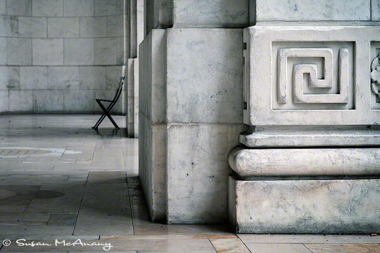
Summer is winding down in most parts of the country, but it’s still hot-hot in Florida. A great time to go to the beach, swim in the pool and have generally laid back tropical days. Sometimes it is hard to get motivated to take photos and for me that is when a self-assign assignment comes in handy. This past month, my assignment has been architecture. It helped that I had a trip planned to NY City, the land of meg sky scrappers and lots of positive energy. It was very steamy there also, so I didn’t get quite as many images as I had planned, but I love the ones I got.  I have uploaded a few to my site, that I invite you to visit. Here is one to entice you.

“Rest Stop”

architecture photo art print
Interior courtyard of city building.

Thanks for visiting and more of my work can be viewed on my website.


Life is like riding a bicycle. To keep your balance, you must keep moving.

Albert Einstein

Dali on My Birthday Weekend

Although I am posting this a few weeks after my birthday, I wanted to tell about my trip to the Dali Museum in St Petersburg, Florida. I had been there once before and was totally inspired and will say this repeat trip did not disappoint.  The museum in St Petersburg, FL is a new building designed specifically to house his work and reflects his vision in many ways, so a visit is a total submersion in Salvador Dali and a truly a delightful experience.

It was a very busy Sunday, so  we walked through the museum opposite the crowds, which allowed me to view his pieces with a different perspective.  I was astounded with the artistic development  in Dali’s work. Although, his initial pieces were perfectly crafted with incredibly detailed, they came across more simplistic in thoughts and concepts. As Dali evolved as an artist his work become massive and complex, with many underlying themes reflecting the social themes of the decade and I am sure his personal experiences. Also evident was the influence of other artist’s and masters of the times, proving even the best need others to craft their vision. Dali even broke out into different modalities, at one time designing jewelry.  This reminded me of celebrities designing a line of clothing, fragrance or jewelry.  Who knows what further notoriety and success Dali would of claimed had the Home Shopping Network had been around.

It was truly an inspirational day. My work can be viewed at Susan McAnany Photography.